Posts

Portfolio

Image
As the semester comes to a close, my portfolio project highlights all my projects of Art 210, Digital Media. This took me about 4 hours and it was fun to reflect on everything I've done this semester in class. I enjoyed my time in this class and am happy to have learned everything I did.

Animation Audio Final Youtube Link

Here's the link to my audio final for my last Art 210 project! https://youtu.be/YlAhbIwQU1k My animation project was probably the hardest assignment I had to complete this year. The story behind it was that I fall asleep i n Tampa and have a dream with an airplane in it. Then I wake up magically at home in Connecticut. For about the first 60 clips of the video, I had to paint on each and every flower, over and over again. I had to try to replicate the flowers, as they were in the previous clip, and add onto the scene which was extremely tedious. The middle of my animation, I started with some rotoscopy, but then copied and pasted aniamtions and moved them across the screen to represent my dream. It was very difficult to keep track of my layers and to figure out how to copy and paste animations while keeping the background intact. In the end of my animation, I had to ‘return’ to reality, so I split my animation into 2 different parts, so figureing out how to execute th

Autoscopy

Image
This shows my happy place that I go to when I feel like my world is getting darker. I like to go out into nature, or imagine I'm surrounded by it, and be with my dog and watch some movies on my laptop.  I took a total of 5 photos, and in Adobe Illustrator, used the lasso tool to cut myself out of the photo below, and insert it into the photo of my dorm room couch. I used transparency layers to edit the picture of the forest, and added a water color filter to the photo of the couch. I used the lasso tool to cut out the dog and the laptop, and inserted them as well. I then used the paint tool to create the ‘darkness’ and took a long time using different style brushes and erasers to make it look as if it’s dissolving.   25% Quality: 50% Quality: 75% Quality:  100% Quality: Playing with different GIF Formats: Here I limited the colors to 32, and made white transparent  Here I limited the colors to 16 while keeping white transparent Here I limited

Black and White To Color Project

Image
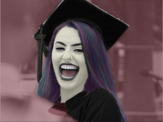
In Adobe Ilustrator, I chose a picture from my high school graduation and made it black and white. Then, I used the paint tool and started to color on myself. I zoomed in a lot to make sure I could color in the details in order for it to look realistic. I darkened my cap and robe to keep a color theme going, and added black lipstick with black ‘paint’. I then added a nose piercing and eyebrow piercing to top off the punk look. I made the background purple because I, again, wanted to maintain a color theme. I had a lot of fun with this project.  

Somewhere Final Project

Image
In Adobe Photoshop, I edited a photo of me and Forrest Gump sitting together on the iconic bench from the movie. I took the original photo and used the lasso tool to outline myself and cut myself out. This part took awhile because I wanted it to look seamless and have the background from the original image be completely erased. Once I cut myself out, I added myself to the scene and ended up cutting out my feet because it didn’t fit in the frame. I then played with the filters and setting of the images to try and make it seem as realistic and seamless as possible.  

Name in Binary Code

Alicia Afonso 01000001 01101100 01101001 01100011 01101001 01100001 00100000 01000001 01100110 01101111 01101110 01110011 01101111

Poster Final Project

Image
Here's my final poster project, the first picture is the image I finalized.  The poster project was done in Adobe Illustrator. I brainstormed an issue I’m passionate about and came up with this. I took a selfie with a plant pot and used image tracing in black and white to create the design below. I had to draw in with paint some details that didn’t transfer such as the rest of my mouth, parts of the pot, and details on my body. I also added in a plant stem to reinforce the message of my poster. I chose a green color theme and had black, and a lighter green theme to keep it all coherent. Lastly, I added text saying my message.